<!DOCTYPE html>
<html lang="en">
<head>
<link href='https://fonts.googleapis.com/css?family=Roboto' rel='stylesheet' type='text/css'>
<meta charset="utf-8">
<title> Interactive map visualization</title>
<script type="text/javascript" src="https://cdnjs.cloudflare.com/ajax/libs/d3/3.5.6/d3.min.js"></script>
<script src="https://d3js.org/d3.v4.js"></script>
<script src="https://d3js.org/d3-geo-projection.v2.min.js"></script>
<script src="https://d3js.org/d3-scale-chromatic.v1.min.js"></script>
<script src="https://cdnjs.cloudflare.com/ajax/libs/topojson/1.6.19/topojson.min.js"></script>
<style type="text/css">
body {
margin: 0;
background-color: whitesmoke;
font-family: 'Times New Roman', sans-serif;
font-weight: 300;
}
#svgcontainer {
width: 1000px;
margin-left: auto;
margin-right: auto;
margin-top: 50px;
padding: 5px 50px 10px 50px;
background-color: whitesmoke;
}
h1 {
font-weight: 800;
color: #5a7388;
font-size: 48px;
margin-bottom: 10px;
}
svg {
background-color: whitesmoke;
}
</style>
</head>
<body>
<div id="svgcontainer">
<h1>Interactive map visualization</h1>
<div id="svganchor"></div>
<br>
</div>
<script type="text/javascript">
let w = 1000;
let h = 800;
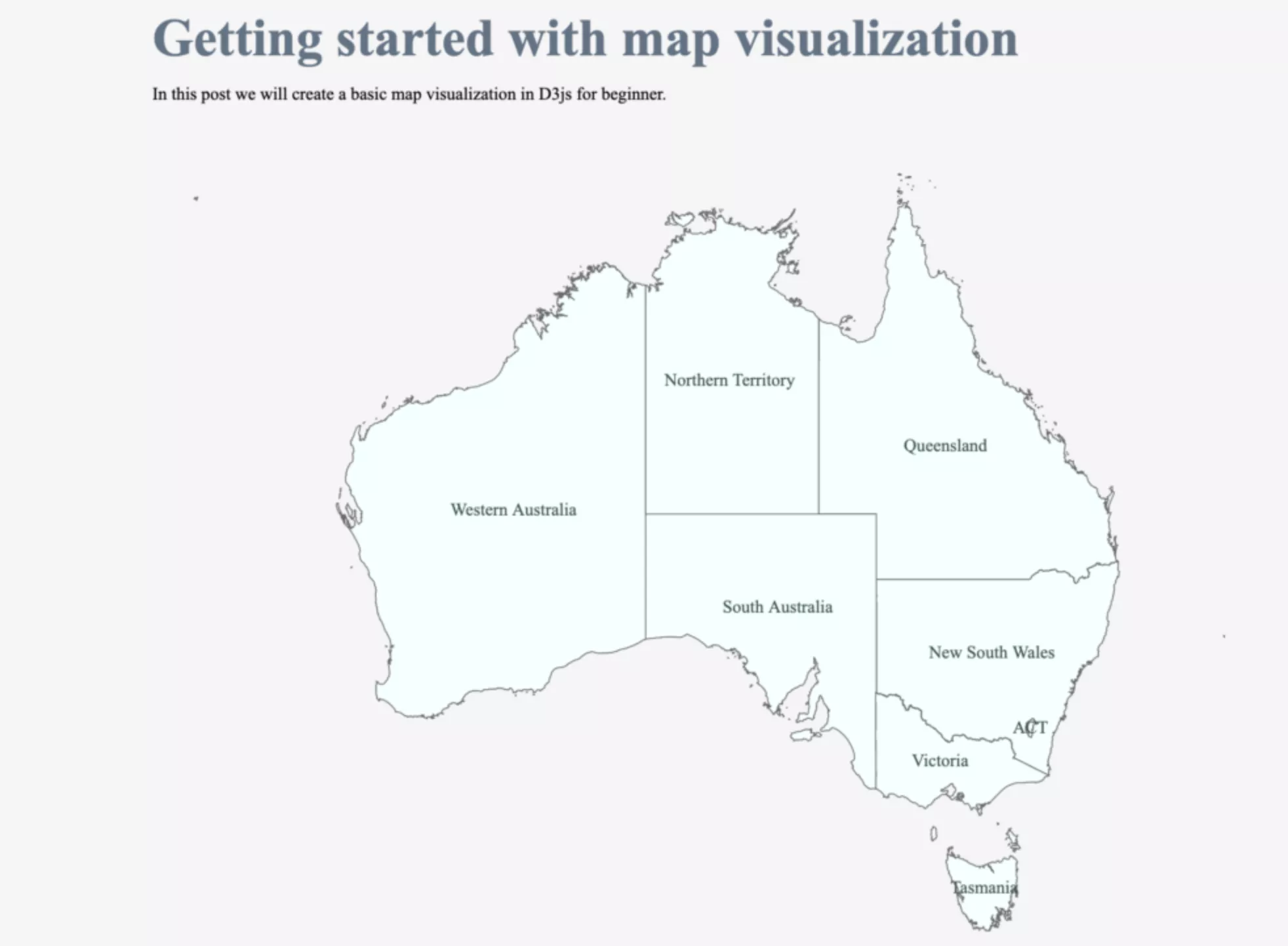
let projection = d3.geo.mercator()
.center([132, -28])
.translate([w / 2, h / 2])
.scale(1000);
let path = d3.geo.path()
.projection(projection);
let states_color = d3.scale.ordinal()
.range(['#faf7d4', '#faf7d4', '#faf7d4', '#faf7d4', '#faf7d4', '#faf7d4', '#faf7d4', '#faf7d4', '#faf7d4']);
let svg = d3.select("#svganchor")
.append("svg")
.attr("width", w)
.attr("height", h);
d3.json("aust.json", (json) => {
svg.selectAll("path")
.data(json.features)
.enter()
.append("path")
.attr("d", path)
.attr("stroke", "dimgray")
.style("opacity", 1)
.attr("fill", (d, i) => { return states_color(i) })
.each((d, i, j) => {
let firstChild = j[i].parentNode.firstChild;
if (firstChild) {
j[i].parentNode.insertBefore(j[i], firstChild);
}
});
svg.selectAll("text")
.data(json.features)
.enter()
.append("text")
.attr("fill", "darkslategray")
.attr("transform", (d) => { return "translate(" + path.centroid(d) + ")"; })
.attr("text-anchor", "middle")
.attr("dy", ".35em")
.text((d) => {
return d.properties.STATE_NAME;
});
svg.append("text")
.attr("x", 0)
.attr("y", 340)
.attr("font-size", 90)
.attr("font-weight", "bold")
.attr("font-family", "Times New Roman")
.attr("text-anchor", "middle")
.attr("opacity", 0.5)
});
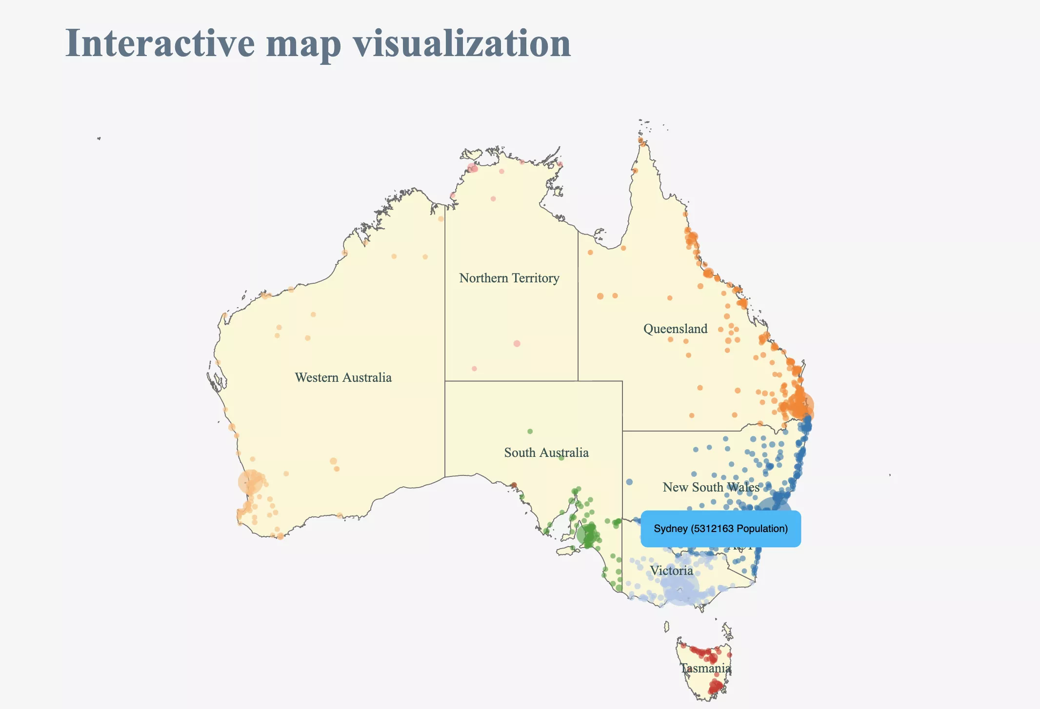
d3.csv("population_data.csv", (data) => {
let color = d3.scale.category20();
let valueExtent = d3.extent(data, (d) => { return +d.n; })
let size = d3.scaleSqrt()
.domain(valueExtent)
.range([1, 20])
let tooltip = d3.select("body")
.append("div")
.style("position", "absolute")
.style("text-align", "center")
.style("padding", "15px")
.style("font", "12px sans-serif")
.style("background", "#03bafc")
.style("border", "0px")
.style("border-radius", "8px")
.style("z-index", "10")
.style("visibility", "hidden")
.text("a simple tooltip");
svg
.selectAll("myCircles")
.data(data.sort((a, b) => { return +b.n - +a.n }).filter((d, i) => { return i < 1000 }))
.enter()
.append("circle")
.attr("cx", (d) => { return projection([+d.homelon, +d.homelat])[0] })
.attr("cy", (d) => { return projection([+d.homelon, +d.homelat])[1] })
.attr("r", (d) => { return size(+d.n + 1) + 2 })
.style("fill", (d) => { return color(d.state) })
.attr("stroke-width", 1)
.attr("fill-opacity", 0.6)
.on("mouseover", () => {
return tooltip.style("visibility", "visible");
})
.on("mousemove", (d) => {
tooltip.text(d.city + ' (' + d.n + ' Population)');
return tooltip.style("top",
(d3.event.pageY - 10) + "px").style("left", (d3.event.pageX + 10) + "px");
})
});
</script>
</body>
</html>